How to customize my website bot?

Written by Medha Anand
Updated on March 17th, 2023
- Getting Started
- Bot Building
- Smart Agent Chat
- Conversation Design
-
Developer Guides
Code Step Integration Static Step Integration Shopify Integration SETU Integration Exotel Integration CIBIL integration Freshdesk KMS Integration PayU Integration Zendesk Guide Integration Twilio Integration Razorpay Integration LeadSquared Integration USU(Unymira) Integration Helo(VivaConnect) Integration Salesforce KMS Integration Stripe Integration PayPal Integration CleverTap Integration Fynd Integration HubSpot Integration Magento Integration WooCommerce Integration Microsoft Dynamics 365 Integration
- Deployment
- External Agent Tool Setup
- Analytics & Reporting
- Notifications
- Commerce Plus
- Troubleshooting Guides
- Release Notes
Table of Contents
Customizing the SDK
The SDK can be configured in a variety of ways to fit in seamlessly with the overall experience of the parent application.
Glossary
primary-colortablet-bg-colortypographywidget-positioningmove-the-bot-widgetcustom-buttonprivacy-policy-urlcustom-cssmodeenable-typing-suggestionsenable-user-feedbackbot-typecomposer-placeholderchat-bubble-text-desktopchat-bubble-text-mobileuser-feedback-tagsuser-feedback-questionshide-composerignore-storageinitialize-languageno-crossno-chat-bubbleno-headervoice-bot-initial-inputonChatWindowHidefile-attachment-icon-visibilitydisable-bot-prompt-soundbot-prompt-sound-url
UI Settings
primary-color
The primary color is used throughout the SDK. This should ideally be the same as your brand's primary color.
default: #00000
window.haptikInitSettings = {
...
primary-color: "#00000"
...
};
tablet-bg-color
Use this setting to change the background fill color. Note that this is only for tablet mode.
default: #EDEEF4
window.haptikInitSettings = {
...
tablet-bg-color: "#00000"
...
};
typography
The font family is used throughout the SDK. It must be a google font. You can see available fonts here: https://fonts.google.com/
default: Roboto
window.haptikInitSettings = {
...
typography: "Roboto"
...
};
widget-positioning
The portion of the window where the SDK is rendered (along with the Let's chat with us button).
Possible Values:
-
bottom-left: Places the SDK on the bottom left part of the page -
bottom-right: Places the SDK on the bottom right part of the page -
center: Places the SDK in the center of the page.
default: Bottom Left
window.haptikInitSettings = {
...
widget-positioning: "bottom-left"
...
};
move-the-bot-widget
If you want to adjust the bot widget on your website/store according to your preference, the below script will help you accomplish that:
<style>
.xdk-iframe{
    padding-bottom: 100px;
}
</style>
custom-button
Whether to hide the main chat button or not. Set this to true if using your own custom button implementation. When set to true hides the default button.
default: false
window.haptikInitSettings = {
...
custom-button: false
...
};
privacy-policy-url
If GDPR is enabled, you can add a URL to your Privacy Policy page through init settings. Users will be redirected to this URL when they click on the link in the GDPR view. If not provided users will be redirected to Haptik's privacy policy page.
window.haptikInitSettings = {
 ...
 "privacy-policy-url": "URL_TO_YOUR_PRIVACY_POLICY_PAGE",
 ...
};
custom-css
A custom CSS file can be injected into the XDK, which will allow modifying its styles. This parameter takes a path of the CSS file, which can either be relative or absolute.
Example: /overrides.css
.header, .minimized-view, .composer, .composer > textarea {
 background-color : black !important;
}
.header, .minimized-view, .composer > textarea {
 color: white !important;
}
.taskbox-body {
 border-radius : 0 !important;
}
.taskbox-body .taskbox-tab {
 width : 100px !important;
}
.taskbox-body .taskbox-tasks>.task:hover {
 background-color: beige !important;
}
Use the file as below.
window.haptikInitSettings = {
 ...
 "custom-css": "./overrides.css",
 ...
};
List of CSS selectors:
For chat icon:
CSS selectors
|
Usage |
|---|---|
.minimized-view |
For chat icon wrapper |
.minimized-view-icon |
For chat icon |
.minimized-view-text |
For chat icon text |
.minimized-view-unread-count |
For chat icon unread notification circle |
.minimized-view-cross-icon |
For cross chat icon |
For task-box:
CSS selectors |
Usage |
|---|---|
.taskbox-body |
For task-box wrapper |
.taskbox-tab-wrapper |
For task-box top handler |
.taskbox-tasks |
For task-box list |
.taskbox-tasks > task |
For task-box list item |
For composer:
CSS selectors |
Usage |
|---|---|
.composer |
For composer wrapper |
.composer-icon |
For composer icon |
.composer-icon.left |
For left composer icon |
.composer-icon.right |
For right composer icon |
.composer-text-area |
For composer text area |
For message window:

CSS selectors |
Usage |
|---|---|
.extended-view |
For chat window |
.header |
For chat window header wrapper |
.header-top |
For chat window header top bar |
.header-promo |
For chat window header expanded view |
.message-section-messages |
For message section - wrapper |
.timeline-message |
For timestamp message |
.message-section-message-row |
For message row containing messages |
.message-section-message-row.from-user |
For user messages |
.message-section-message-row.from-business |
For bot messages |
.fixed-bottom-area |
For transparent area at the bottom of message section |
mode
This setting governs the initial view of the SDK. Supporting use cases where the SDK should always be open.
Possible Values:
-
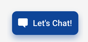
default: Shows a default Let's Chat with us button -
fsm: Loads with the chat window open by default without a cross button
default: Default
Currently "mode": "fsm" is not supported on IVA with custom signup.
Feature Settings
enable-typing-suggestions
Enables typing suggestions for the bot. Typing suggestions are autocomplete suggestions that show up for users when they type. This gives the user some context around the capabilities of the bot.
default: false
window.haptikInitSettings = {
...
enable-typing-suggestions: false
...
};
enable-user-feedback
Enables per message user feedback for the bot. Adds feedback icons to all bot responses to freeform user input in order to collect feedback. It's a 2-stage process where the user can quickly give a thumbs-up/thumbs-down. Once done, the user can then also optionally give more detailed feedback in the form of tags and a freeform comment.
default: false
window.haptikInitSettings = {
...
enable-user-feedback: false
...
};
bot-type
The SDK supports both voice and text base conversations. This setting can set that accordingly.
Possible Values:
TEXT: A text based conversational interface where the user is expected to use the keyboard to send messages.
VOICE: A voice based conversational interface where the user can also send messages using voice. The bot messages are spoken out aloud.
default: TEXT
window.haptikInitSettings = {
...
bot-type: "TEXT"
...
};
Text Settings
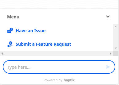
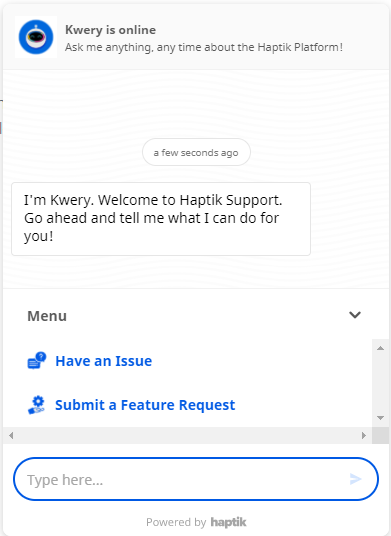
composer-placeholder
The placeholder text for the composer (typing area). This is the text that's shown in the typing area when it's empty
default: Type here...
window.haptikInitSettings = {
...
composer-placeholder: "Type here..."
...
};
chat-bubble-text-desktop
The chat bubble text on desktop browsers. Set it to _NONE_ if you don't want to show any text and just the chat icon.
default: Chat with Us
window.haptikInitSettings = {
...
chat-bubble-text-desktop: "Chat with us"
...
};
chat-bubble-text-mobile
The chat bubble text on mobile browsers. Set it to _NONE_ if you don't want to show any text and just the chat icon.
default: Chat with Us
window.haptikInitSettings = {
...
chat-bubble-text-mobile: "Chat with Us"
...
};
user-feedback-tags
An object containing textual copies of the tags to show when showing the per usage message feedback. Note: User feedback needs to be enabled
Object Structure + Default
 'user-feedback-tags': {
 // tags to show when feedback is positive
 // <array of strings>
 'positive': [
 'Seemed human',
 'Easy to understand',
 'It was relevant',
 'That was fast'
 ],
 // tags to show when feedback is negative
 // <array of strings>
 'negative': [
 'Unrelated response',
 'Delayed response',
 'Repetitive response',
 'Unhelpful message'
 ]
 }
user-feedback-questions
An object containing textual copies of the questions to show when showing the per usage message feedback. Note: User feedback needs to be enabled
Object Structure + Default
 'user-feedback-questions': {
 // when feedback is positive
 'positive': 'Yay! What did you like?',
 // when feedback is negative
 'negative': 'Sorry about that. What went wrong?'
 }
Disable Settings
hide-composer
Hides the composer so that the user is not given the option to type anything. This is useful when building actionable and highly directed bots.
default: false
window.haptikInitSettings = {
...
hide-composer: true
...
};
ignore-storage
In order to store the conversation history, mark the ignore-storage parameter as false.
If ignore-storage is true the storage is disabled, i.e. a new user is created every time the user comes back and starts conversing with the bot. No messages/user information is stored in local storage. Essentially, every user is treated like a first-time user.
default: false
window.haptikInitSettings = {
...
ignore-storage: false
...
};
initialize-language
Code of language you want to open bot with. For eg en, hi. (Optional). We support ISO_639-1 language codes.
default: en
window.haptikInitSettings = {
...
initialize-language: "en"
...
};
no-cross
Hides the cross button so that user is unable to close the chat window. This is useful when building experiences with custom chat buttons and other customised UI elements.
default: false
window.haptikInitSettings = {
...
no-cross: false
...
};
The user will be slightly able to see the close button but they won't be able to click on the button.
no-chat-bubble
Hides the chat bubble. The SDK then needs to be opened and controlled programmatically.
default: false
window.haptikInitSettings = {
...
no-chat-bubble: false
...
};
no-header
Hides the chat window header. This is useful when integrating inside native apps and webviews where there's already a header present outside the webview.
default: false
window.haptikInitSettings = {
...
no-header: false
...
};
Miscellaneous Settings
voice-bot-initial-input
The default state of the voice bot. Should it by default have the text composer or the voice composer?
Possible Values:
-
TEXT: Show the text composer by default -
VOICE: Show the voice composer by default
default: VOICE
window.haptikInitSettings = {
...
voice-bot-initial-input: "VOICE"
...
};
onChatWindowHide
In case you want to be notified whenever the chat window is closed/hidden, you can pass a callback function to this parameter. This callback function will now be called every time the chat window is closed.
<script>
 const hideEventCallback = function () {
 console.log("Haptik JS SDK is now hidden.");
 }
 window.haptikInitSettings = {
 'business-id': YOUR_BUSINESS_ID,
 'client-id': YOUR_CLIENT_ID,
 'base-url': BASE_URL,
 onChatWindowHide : hideEventCallback
 }
</script>
file-attachment-icon-visibility
In case you want to manage the visibility of the file attachment icon, you can use this function.
window.haptikInitSettings = {
...
file-attachment-icon-visibility: "value_name"
...
};
You can use three types of values in the value_name field, as mentioned above:
- only_agent (default - File attachment icon shown only when chat is in Agent chat mode)
- always (File attachment icon shown all the time)
- hidden (File attachment icon is never shown)
disable-bot-prompt-sound
This disables the notification sounds ideally triggered when a bot prompt messages are added to the bot.
default: false
window.haptikInitSettings = {
...
disable-bot-prompt-sound: false
...
};
bot-prompt-sound-url
Use this setting to change the bot prompt sound. If no custom tone/sound is provided by the user, the bot loads the default tone.
default: https://toolassets.haptikapi.com/js-sdk/sound/notification_new.mp3 */
window.haptikInitSettings = {
...
bot-prompt-sound-url: https://toolassets.haptikapi.com/js-sdk/sound/notification_new.mp3 */
...
};